iPad Portfolio App Review
In the old days (not really so long ago.. say 5 years ago) you had to carry around a portfolio of real printed images for clients. Now, with the iPad, you can create a dazzling and versatile portfolio that is easier to swap out images, and will impress your clients. One thought though… Don’t use this as a leave-behind portfolio…
I first started using this app just over a year ago and on the first version of iPad. The program worked flawlessly, and has since been upgraded for the brand new IPad with retina graphics.
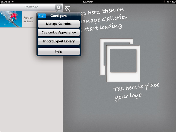
With Portfolio for iPad, you can create as many galleries as you want, and change them around in the application through the admin settings. Click and drag photos in the order you want them displayed, and double-tap to remove them. It really is a simple way to run and modify your ever-changing portfolio. With paper portfolios, you would have to pull out the image you don’t want, and print the new one to modify it. This is something that most people rarely will do and their portfolios become stagnant.

There are several ways to import your photos, and I highly recommend watching the video on the app’s site here. This can be a bit confusing the first time, but once you get the hang of it, can be really simple. Either use ITunes, a website, or dropbox for importing photos. Dropbox is a free cloud service that is much like iCloud, but accessible to any file type. It’s also completely free for up to 2GB. By using dropbox, I also have a dropbox folder on my computer. Anytime I want to add a new image, I simply place it in that folder, and open up the Portfolio app on my IPad. I then access the dropbox and click import image.
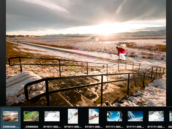
This makes for a fast and smooth transfer of images. It may sound like a lot written out, but it’s actually a speedy and simply process. Images can be imported at large sizes, up to 2048×2048. This allows the viewer (and you) to tap on the image to zoom in and see details. It also ensures that the images look great on the new IPad.

What’s most important as a photographer showing a portfolio, is high quality imagery. The high resolution of photos in this app, combined with the glossy and bright display, makes the photos look better than they do even on your computer screen at full res. You can be assured that your images will look spectacular. Add to that the fact that you can fully customize the app, and brand with your logo as well, and you have a very finely tuned portfolio.
The portfolio also has a built-in slideshow process, so if you are working out of an office, or if you want to put on a show for clients/friends/or family, you can run this to show off your work. I haven’t had a need for this much yet, but it does work really well.

Keep in mind that people do often get distracted by the iPad though when they should be more focused on your work. That’s a potential hang-up that I’ve experienced before, but as more and more generations of iPad’s come out, this problem is going away with everyone being accustomed to the technology.
Because this program has every feature we could want in a portfolio, and is easy to use and setup, we give it a 5 out of 5. At $15 in the App Store, it’s a bit on the pricey side, but well worth every penny!


No comment posted yet.